I made a short video showing a method I use to color an ink drawing digitally (specifically in Photoshop).
ink
Process Post - Materials I use
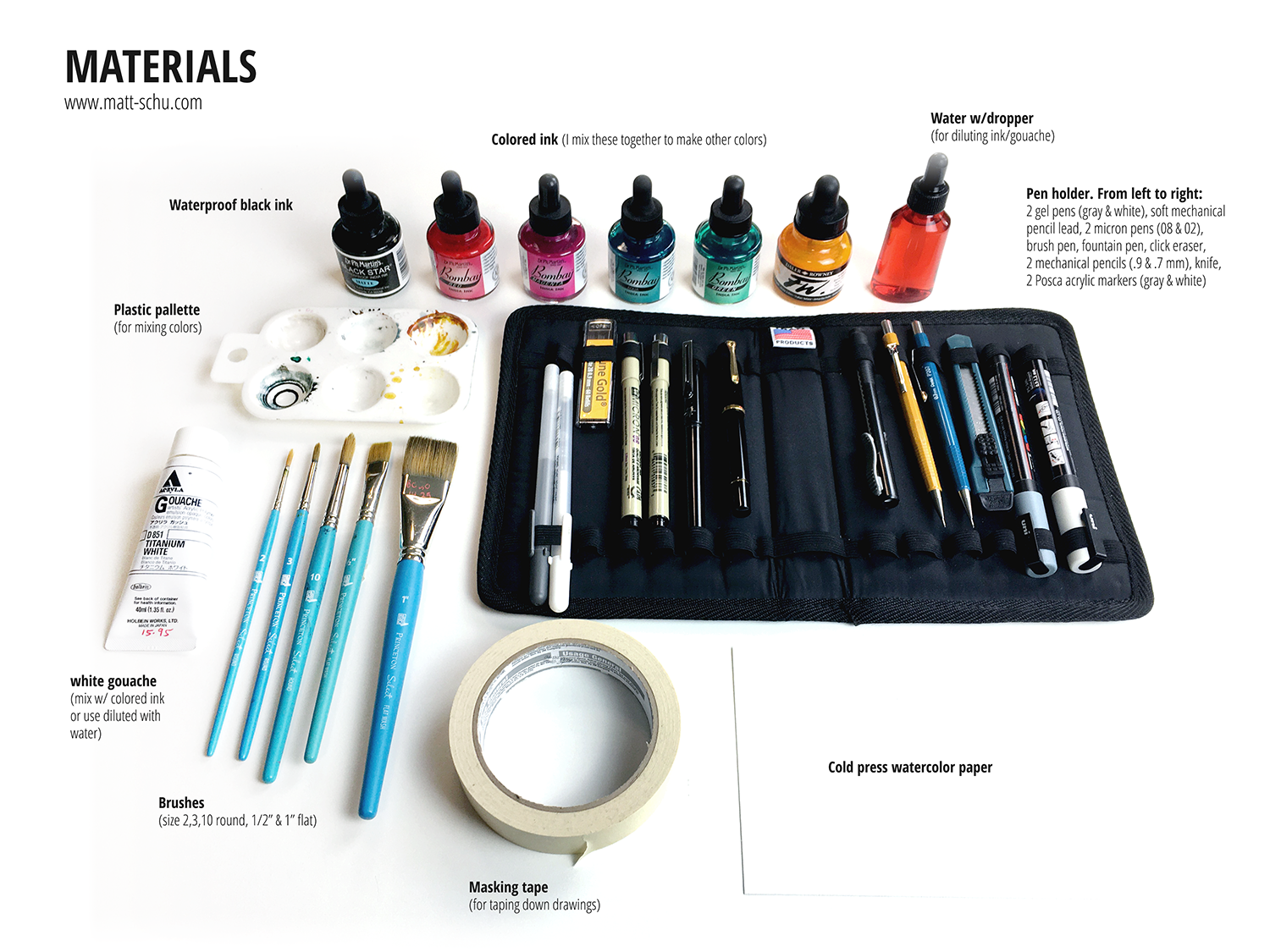
I’m always curious about the materials other artists use, so I put together this post of my materials (scroll down to see pics). Generally speaking I use pens & ink & gouache on watercolor paper. I mix the ink in a palette and dilute with water to change the opacity/intensity of the colors. I try to keep my setup as portable as I can, so — other than the bottles of colored ink and the varnish — I carry all of this with me in my backpack wherever I go.
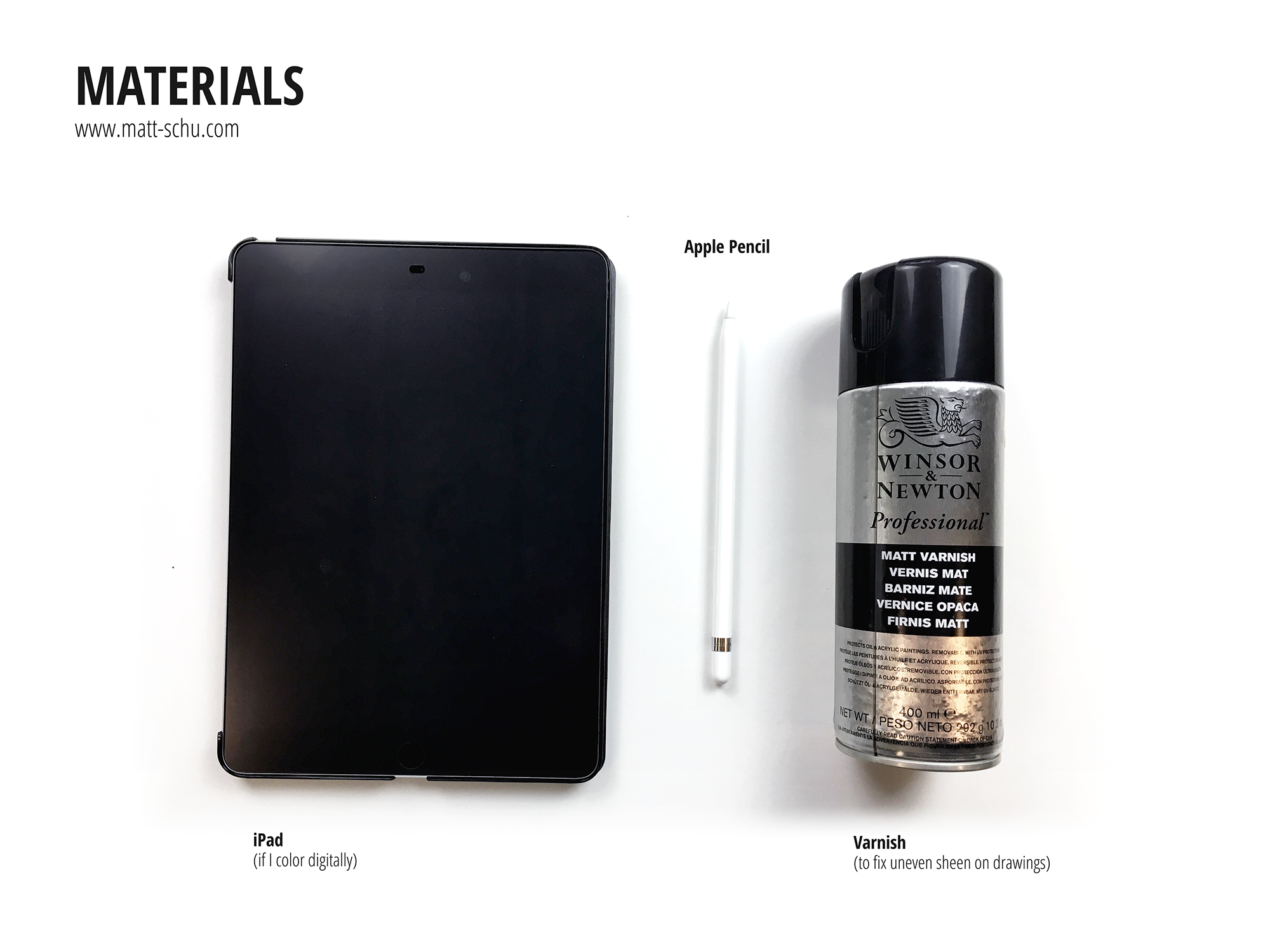
Not pictured is the Epson scanner I use. When I’m done with a drawing I’ll scan it as a 600dpi PNG and then open it in Photoshop to adjust the colors and contrast to match the real life version as much as I can. Alternately, if I planned to add color digitally, I’ll scan the grayscale ink drawing and add color in Photoshop. When I do this, I’m not concerned with making the scanned grayscale version match the real life version as much as I’m concerned with making the contrast strong. When coloring digitally, I’ll use my iPad as a drawing tablet connected to my computer. To do this I use the app Astropad.
Here’s are some random tips:
Windex (or generic window cleaner) works just as well as pen cleaner, if not better, for a fraction of the cost.
Buy masking tape at a paint store, not the art store. The paint store will have more options for way cheaper.
When applying the varnish, build up thin coats. If you put on too much, it can pool weirdly and leave a white powdery residue (and it’s a waste).
I apply linework and spots of black first, then add color/shading with ink. That’s why the black ink being waterproof is very important to my process.
Process Post - Caught in the Rain
Here’s a summary of my process for a recent drawing, which I’m calling “Caught in the Rain”. This is one of several drawings featuring this old man and his black cat.
I wanted to draw these characters again, and I also wanted to draw some rain. After coming up with the idea, I started with a quick thumbnail sketch (fig. 1) to make sure I liked the layout (when I draw I use Xs to indicate which areas will be filled with black).
Next I made a grayscale ink drawing on watercolor paper (fig. 2). I drew the outlines with a micron pen, then added gray tones with a series of washes of diluted black ink. After that, I added black with a brush and ink, and drew the rain with gel pens and a ruler.
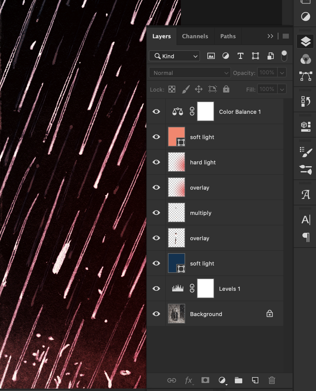
Once the grayscale drawing was done, I scanned it and opened it in Photoshop (fig. 3). In Photoshop, I adjusted the black/white/gray levels to make sure the contrast looked good and had pure black and white. Then I added color with layers set to different modes (fig. 3). Overlay & Soft/Hard Light modes tint the original ink drawing below, while Multiply adds a translucent spot of color.
After this, I adjusted the color balance and saturation to make the colors look how I wanted them to. Adjusting the color balance is also a great way to unify the color palette. I use adjustment layers when I can because they give me flexibility to change things later, as they don’t edit the original drawing in a permanent way.
Anyway, then I saved the finished drawing (fig. 4) and later posted it to social media. Now I’m blogging about the process and you’re reading it. And hopefully you found this interesting or helpful in some way.